One of the most beautiful parts about design is seeing what other people enjoy.
This item is available in full to subscribers.
We have recently launched a new and improved website. To continue reading, you will need to either log into your subscriber account, or purchase a new subscription.
If you are a digital subscriber with an active subscription, then you already have an account here. Just reset your password if you've not yet logged in to your account on this new site.
If you are a current print subscriber, you can set up a free website account by clicking here.
Otherwise, click here to view your options for subscribing.
Please log in to continue |

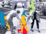


One of the most beautiful parts about design is seeing what other people enjoy. We all have our preferences, but in design the only path towards growth is to appreciate how everyone can put together their own world in unique and wonderful ways.
At the time of my first design project, my personal color preferenceswere heavily weighted towards spaces with simple and stark contrasts. Black and white, particularly white, held my attention. I was drawn to subway tile as a design element with the same level of enthusiasm as a 14 year-old who believes they are the very first person to discover the Beatles. “Don’t you get it? This is really good!”
I recently had the distinct pleasure of revisiting that first design project with my clients, the Cohen family. What struck me is how I learned to open myself up to vibrant color at a time when my instincts would have led me in a different direction. Watching Amy Cohen choose the red fabric for her Coca Cola red couch was like watching a chef select a French cheese. It was like she could taste the color.
In letting go and embracing the creative elements that she was drawn to, I saw the power of deeply saturated color; its warmth and vibrant energy. I learned to let that light get all over me. Falling in love with someone else’s style is like learning their language. It is a rare bond to share with another human.
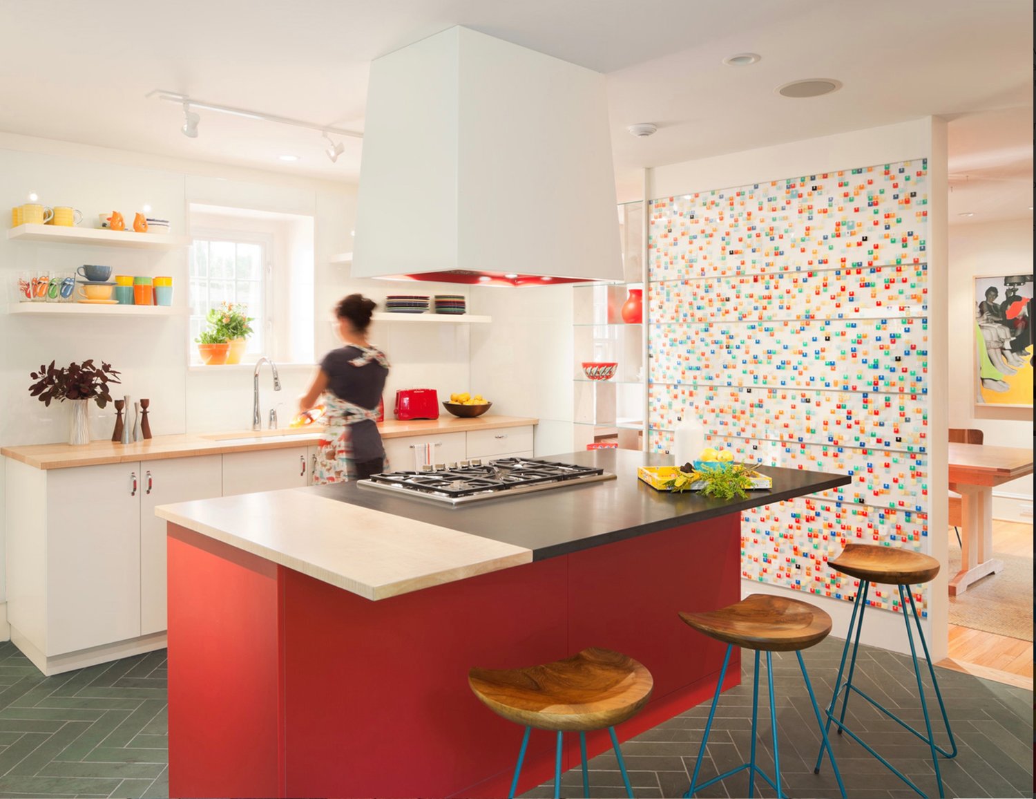
In our collaboration, we got to create many custom pieces for the Cohen’s home. One of the most striking was a kitchen wall that featured more than 1,500 bread tabs layered between five sheets of clear acrylic.
This unique installation came about through a connection with Paul Schultz, a beloved teacher at Charter High School for Architecture and Design. Paul and his students had collected the tabs over all the years that he was teaching them how to train their eyes, and see. When I saw the huge glass containers of colorful tabs I knew Amy would love them.
From there, the only thing we had to figure out was how to use them in the most effective way possible. The kitchen wall was assembled, in our office, by Paul and three of his architectural students.
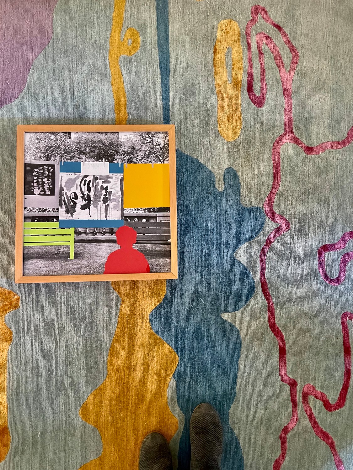
Another choice we made to accentuate the vibrancy of the house was to color blott old Cohen family photos and stack the framed prints. This element was not original, but was a homage to John Baldessari, an artist whose vision seemed to resonate at the same frequency as the rest of the project. It took hours to go through hundreds of photos to find the perfect few. After trying endless variations, we finally ended up with three prints we knew were the “ones.”
While the idea we started with was heavily influenced by someone else, it eventually morphed into something unique for this specific house. After so many hours of looking at these printed and drawn images around the office, it hit us like a bolt of rainbow lightning that the floor covering should be custom too. At that point, we took the photo with the most meaning for the family and blew it up into an 8-by-10 wool and silk custom rug.
Amy cried the first time she saw it.
Bringing disparate elements and colors together in a pattern that makes sense for the people who live and work there is part of the magic of making a home. It happens when one pays attention, and rewards the effort with new discoveries.
Homes, as opposed to houses, take items that are sitting in plain sight and give them the appreciation that they’re due – like bread tabs on the street. We draw the connections and make the meaning.
May we all of us get to live amongst the colors (even white) that both light our way and ground us to the present.


